
 4 min
4 min
Managing Sprints has always been about striking the right balance between completing new work, maintaining quality, and ensuring timely outcome based delivery.
But most project management platforms either give you generic charts, incomplete and even harmful metrics that drive the wrong behavior within the Product and Engineering Teams, or force you into complex configurations just to get meaningful insights.
That’s why we built Sprint Analytics in Project Simple with an absolutely different philosophy — actionable insights out-of-the-box, no extra setup required.
What Sprint Analytics Shows You
Sprint Analytics is composed of several sections, each designed to take the guesswork out of team performance by providing a clear, data-driven view of every Sprint:
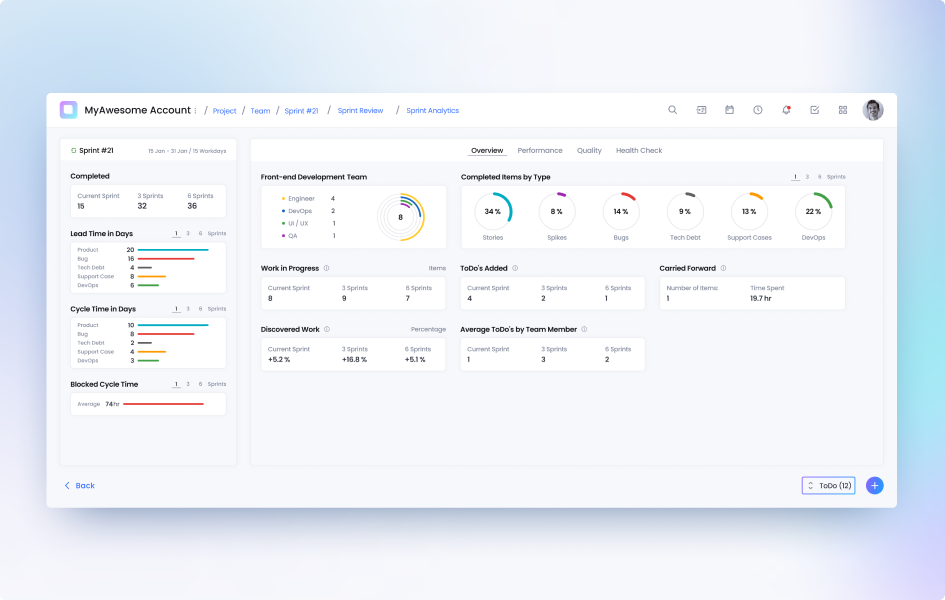
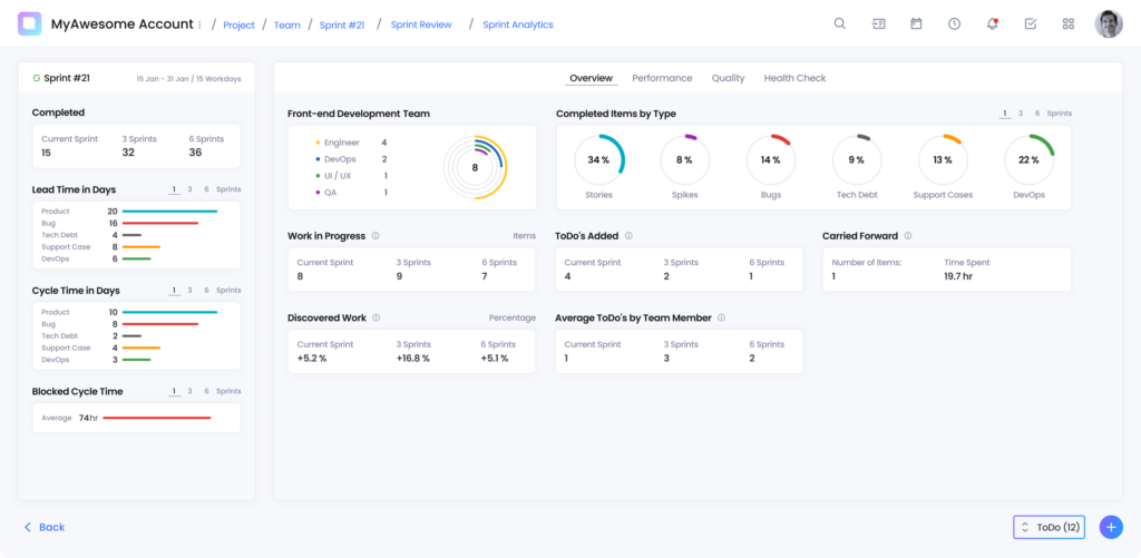
Overview
- Throughput, Lead Time, Cycle Time, Blocked Cycle Time, and average Work in Progress
- Completed items by type (Stories, Bugs, Support Cases, Tech Debt)
- Team composition and contribution
- To-do completion as a Team and by each Team Member
- Discovered work and carried-forward tasks
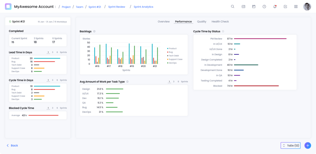
Performance
- Lead Time vs. Cycle Time across multiple Sprints
- Work distribution per role (Dev, QA, UI/UX)
- Cycle Time by Backlog Item status (e.g., “In Development” vs. “In QA”)
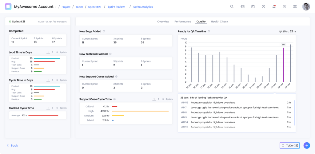
Quality
- New bugs, tech debt, and support cases added per Sprint
- QA readiness timeline and accumulated daily testing workload
- Support Case severity and Cycle Time breakdowns
Team Health Check
- Sprint happiness, work-life balance, satisfaction, and attitude trends
- Simple pulse checks without extra surveys or meetings
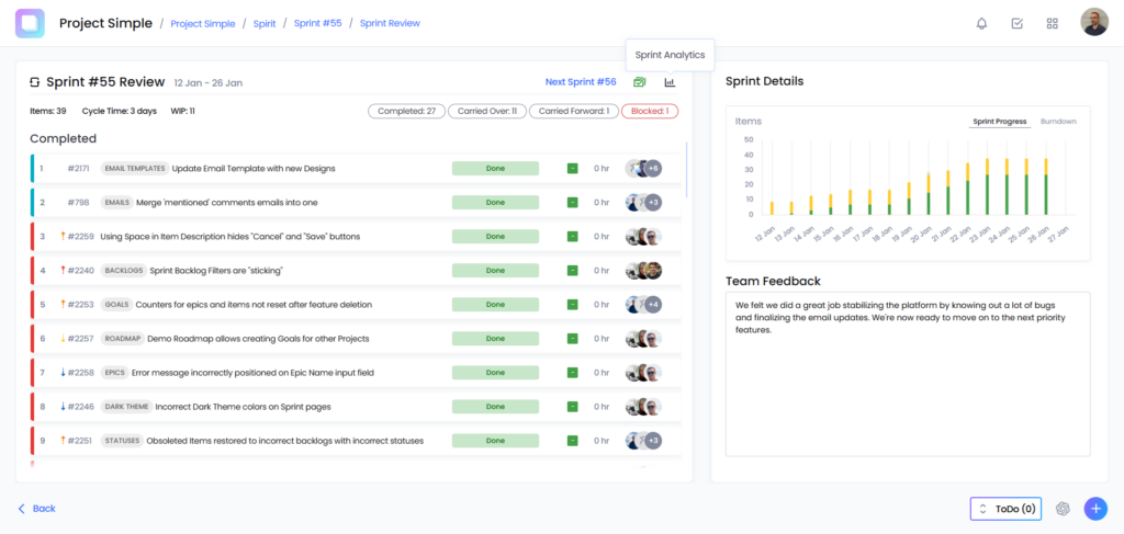
Sprint Analytics is available at anytime during the Active Sprint and especially after the Sprint is finished. All you have to do after the Sprint ends is navigate to the list of All Sprints, open the Sprint Review page for the Sprint you’d like to access and click the Sprint Analytics icon.
What Makes Sprint Analytics Uniquely Useful
Most tools can count issues. Sprint Analytics goes further with built‑in flow metrics that teams normally stitch together with plug‑ins and spreadsheets.
Flow, Minus the Headaches
- Lead Time vs. Cycle Time (per type): See how long work takes from request to release and where it spends time in execution. For example, if the Sprint Lead Time is 35 days for Product vs. 10 days for Bugs, with Cycle Time 24 vs. 6 days — a signal that prioritization, not execution alone, is shaping delivery.
- WIP & Blocked Time: Track Work in Progress across Sprints and spot starvation or thrash. If WIP rises while completion stays flat, the dashboard surfaces it before it becomes a habit.
- Discovered Work: Unique to Project Simple, we reveal the delta between planned and newly found work. Its not uncommon for us to observe our users having Discovered Work that exceeds 300, 400, and even 500%! We noticed a consistent trend how Discovered work is impacting deliveries and is one of the vital unique metrics. However, we must note that even if Discovered Work shows +282% (3‑Sprint view +318%, 6‑Sprint view +343% as we encountered on our Team at some point ) — this is not a failure, but an early warning to re‑plan with reality.
Effort by Task Type — Not Just Issue Counts
- Out of the box, you get effort distribution by role (Design, UI/UX, Dev, QA) and by work type (Stories, Bugs, Tech Debt, Support Cases).
Here’s an example from one of our own Sprints. In Sprint #71 we ran ~49% Dev and ~41% QA effort, with minimal Design/UI/UX work. This helps explain why the Sprint felt busy and where the time actually went.
Cycle Time by Status — Pinpoint the Bottleneck
- See how long items sit in each stage (e.g., In UI/UX, UI/UX Done, In Development, Development Done, In QA). In our example, Development averaged ~26.3 hours while QA held ~17.9 hours.
Now you can decide whether to shift pairing, testing capacity, or review practices with data, not gut feel.
Quality Trends You Can Act On
- Bug & Tech Debt Trending: Track new bugs, tech debt, and support cases added each sprint. If, for example, a Sprint surfaced 16 new bugs and a small uptick in support — a prompt to balance roadmap vs. remediation.
- “Ready for QA” Timeline & Effort: See testable work pile up day by day and the QA effort anticipated to complete the work (e.g., ~48 hours), so you can smooth handoffs instead of killing QAs with sleepless nights or weekends at the end of the Sprint.
- Support Case Cycle Time by Severity: Measure responsiveness by customer impact (Critical/High/Medium/Trivial) and prevent creeping SLAs
The Bug Waterline (Built‑in)
Project Simple visualizes the proportion of bug work vs. product work as a “waterline.” When bug volume consistently sits above the line (e.g., 71% of completed items were bugs this Sprint), you have objective evidence to pause new features and invest in quality.
Why it Matters
For Engineering Teams:
No more sifting through multiple Jira dashboards or cobbling together Excel exports. Sprint Analytics autogenerates insights that help teams see where they’re strong and where they’re blocked.
For Product Managers:
Understand if your Sprints are building customer value (stories) or just fighting fires (bugs, support cases). This visibility ensures product roadmaps aren’t derailed by hidden work.
For Leadership:
Instead of subjective, anecdotal updates, Sprint Analytics provides credible metrics for board discussions: lead times, defect rates, and discovered work trends — all without manual reporting.
How it Compares to Other Tools
Most project management platforms either overwhelm teams with generic dashboards or require heavy configuration and add-ons just to get useful insights. Jira often depends on plugins and external BI tools, Linear keeps analytics intentionally light, and Clickup or Monday focus on broad productivity rather than the realities of engineering delivery.
Project Simple takes a different approach.
Sprint Analytics puts the critical metrics — flow, cycle time, effort by role, discovered work, bug trends, and quality signals — directly into the product. No setup, no integrations, no extra tools, or additional costs. Just the truth about your sprints, available from day one.
| Feature | Project Simple | Jira + Confluence + Tableau | Linear | Clickup / Monday.com |
| Flow Metrics | Built-in | Requires add-ons / setup | Limited | Basic task tracking |
| Cycle Time by Status | Detailed per stage | Manual Configuration | X | X |
| Effort by Role (Dev, QA, UI/UX) | Native | Not standard | X | X |
| Bug & Support trending | Built-in | Plugins required | X | Basic |
| QA effort timeline | Included | Manual | X | X |
| Health Checks | Included | Requires Surveys | X | X |
With Project Simple, everything is included, no setup. The insights are ready on day one, because we believe teams shouldn’t need a data analyst to understand their own Sprint.
Final Thoughts
Sprint Analytics is more than a dashboard — it’s a decision-making engine. By connecting performance, quality, and health data in one place, teams can continuously improve without the overhead of custom reports or third-party integrations.
If you’re tired of fighting your tools to see what’s really happening in your sprints, Sprint Analytics in Project Simple is built for you.
Cut through the noise. Ship with clarity. Make every Sprint count.
